Star Wars Jedi: Survivor Photo Mode Review
- Mik Bromley
- May 9, 2023
- 9 min read

ℹ️ - Star Wars Jedi: Survivor
In a time when it is not entirely uncommon to see AAA game development cycles stretching to 5 or 6 years or more, Respawn Entertainment bucked the trend to produce a sequel to the critically acclaimed Star Wars Jedi: Fallen Order in a little over 3. The doesn't mean that it is just a quick re-hash though, Star Wars Jedi: Survivor is bigger, better and more beautiful than its predecessor in ways that justify the exclusive focus on 'current gen' machines.

- CAL KESTIS // DUAL WIELD -
Although the crew of the Mantis have gone their separate ways in the time between the two stories – the aptly named Battle Scars novel fills that gap by the way – Cal Kestis has continued to learn the ways of the force and developed into a powerful and more imposing Jedi with hints of Episode VI Luke.
Thankfully this is fully embraced in the gameplay as Cal, and BD-1 for that matter, resume their crusade against the Empire with all of the abilities learned during the first game intact. It's a great decision that simultaneously avoids any contrived reset, that would make little sense in the story, and creates a natural route into entirely new sets of skills. As a result, Cal gets many new force abilities and lightsaber techniques, and can even be equipped with that most uncivilised of weapons, a blaster.

Traversal methods get some upgrades too, with rideable mounts and the seemingly now obligatory grapple...
The game itself keeps the same underlying "Soulslike" elements while carrying on the theme of additive development with plenty of extra elements and improvements. Level design is still primarily built around convoluted trails and ability-gated access for example, but some areas also are much more open, to the extent that they feel freely explorable this time, while improved navigation aids and a fast travel system bring significant quality of life upgrades.
It also feels like there is more to do with lots of optional content including side missions, bounties, a game of holotactics, and even a rooftop garden to spend your time cultivating the local flora, as well as some tough traversal challenges and puzzle rooms. Needless to say, the traversal methods get some upgrades too, with rideable mounts and the seemingly now obligatory grapple being added, plus another climbing technique that really just feels like one too many but doesn't stop the 3D platforming from being fun.

- JEDI: SURVIVOR // TRADER -
Upgrade and evolution are very much at the heart of this sequel then, so the real question for virtual photographers is whether the photo mode has been given the same treatment. Despite a few downgrades, such as the removal of the default shortcut button binding, the answer overall has to be a yes.
Respawn have succeeded where other recent high profile photo modes have failed by building on what they already had and bringing some crucial new additions that make all the difference.
Key Photo Mode Features:
Free camera with very large range
Save camera position
Custom 3-point lighting setup
Controls & Implementation:
The first thing you'll likely notice when jumping into the Jedi: Survivor photo mode (apart from that missing shortcut) is the sheer freedom of the camera. Carrying over one of the main strengths from Fallen Order, it is completely free and can be placed anywhere in a huge bounding area that extends a great distance around the character.
Occasionally some invisible gameplay barriers can get in the way, but the extent of movement is so good that even those can be easily overcome. The whole thing is a shining example of what a photo mode camera can easily be like and makes a mockery of the limits we have seen other games impose recently.

- JEDI: SURVIVOR // CAMERA RANGE -
Camera placement is handled with perfectly natural inputs which include horizontal truck & dolly on the LS, 360° pan and 180° tilt on the RS, and vertical craning now done via the L2 / R2 triggers for improved precision. A tabbed photo mode UI, which takes over the use of the L1 / R1 buttons, also houses a ± 90° camera roll, ensuring that you should have absolutely no trouble getting the Survivor camera into position and finding the perfect angle for each shot.

It is no longer possible to adjust any settings while the photo mode UI is hidden...
Elsewhere in the completely redesigned UI, Respawn have made a decent attempt to categorise the features with lens settings, filters, borders, icons, character visibility, and lighting all getting separate tabs. The downside here though, is that the order is not the most logical and leads to a lot of back-and-forth in the workflow.
There is even an initial tab with no settings on it at all; presumably a well-intended "clean" viewfinder, it is largely redundant given that the entire UI is easily hidden with a press of Δ, and it just ends up adding an extra step to get to the camera settings.
- JEDI: SURVIVOR // PHOTO MODE UI -
Once on the second tab, this is where you'll find the majority of the options to work on the composition, including a lengthy 1 - 4x zoom, manual focus control, and aperture settings to create depth of field. All are very useful, but this is where a significant backwards step becomes apparent, well two of them actually.
Firstly, it is no longer possible to adjust any settings while the photo mode UI is hidden. This is especially disappointing given that the larger footprint of the UI obscures much more of the underlying image, and is simply something that all photo modes should allow by now.
The second issue stems from the reallocation of the shoulder buttons and triggers, previously used for fine adjustment of settings in Fallen Order. Without those, all setting changes are now done with the D-pad alone. That's not a problem in itself, but in this case, the steps are simply way too big, an issue that becomes abundantly clear when trying to setup the focus distance.

You'll need to use the camera dolly for accurate focusing...
Ignoring the fact that this scale is labelled in mm when it surely should be cm, the individual adjustment steps shift the focal plane – indicated by a blue holographic wall – by 24 or 25 units. This typically sees the focus jump straight past the intended subject and leaves you needing to settle for the closest step and then reposition the camera to bring the subject into clear view.
It's a problem that would be easily solved with smaller initial increments on the slider, or a secondary button hold for fine adjustment – some food for thought Respawn.

- JEDI: SURVIVOR // NINTH SISTER -
When you do manage to focus the camera accurately, the depth of field effect is good with a soft defocus of both the foreground and background around the subject and a nice circular bokeh. Don't try to relate to the provided aperture values too much though as the field depth is way shallower than you would find in reality, especially at longer zooms, but as a visual tool it's no problem at all.
Exposure compensation is similarly effective and can easily brighten or darken most scenes, while vignette and film grain can be added or removed as required. Note that there is no option to remove the in-game chromatic aberration from the photo mode, so be sure to disable this in the game settings for a clear shot.

Visor-like HUD's can serve as makeshift compositional guides...
Going beyond the optical characteristics, some post-process options can be found in the form of colour filters, all of which are quite strong but include an intensity slider for more subtle application, as well as a bunch of faction icons and graphical borders.
Interestingly, several of the border styles feature visor-like HUD's which, even if you don't choose to use them in shots, can serve as makeshift compositional guides with handy centre and vertical reference points. For me though, it is all about the 2.35:1 CinemaScope crop – it is just a crop and not an ultrawide field of view by the way – which is great for a more cinematic style, especially if you look out for the occasional anamorphic lens flare.
Camera Position & Spotlights:
A lot of this is fairly standard stuff to be honest, so what about those exciting new features? Well, there is a huge one sitting right at the bottom of the second tab along with the main camera settings. Two large buttons read Save Camera Position and Load Camera Position, and they work exactly as you might expect.
Hit Save and the photo mode will store the current position of the camera; hit Load and it will snap straight back to the saved location no matter where you had moved it to. It is a true master stroke and the kind of feature that makes you wonder why everyone hasn't been doing this all along.
Not only is it a wonderful way to "bank" a good composition and protect it from accidental movements, your own curiosity, or even a full settings reset, but it really comes into its own when using what is perhaps the most important other feature of this photo mode, the custom spotlights.
- JEDI: SURVIVOR // 3-POINT LIGHTING -
Marking a major upgrade over Fallen Order's solitary white light, Jedi: Survivor gets 3 separate lights, each with 6 colour options and variable intensity to make a versatile 3-point lighting setup. Lights are placed by simply selecting one of the three numbered UI buttons and turning on a colour. A directional light is then placed in the current camera location, shining in the same direction that the camera is facing.
This means that illuminating a subject is as simple as walking around them and deciding where the light should shine from, and that's where the Save / Load Camera Position functions become absolutely invaluable. With the position saved before you start working on the lights, you are free to roam around to put together a full 3-point setup knowing that you can jump right back to that composition at any time.

The saved camera location and custom lights are a transformative upgrade...
There are a couple of question marks on the UX here though as you will inevitably find that this means a lot of navigation between the 2nd and 6th tabs. The choice to put the light buttons in a row across the top also makes me naturally, and incorrectly, reach for the L1 / R1 buttons instead of the D-pad to swap between them and to add insult to this, that results in a glitch that selects the wrong light when returning.
It could also be argued that the spotlights lack some more advanced features such as beam angle and casting distance, but this implementation is a delightfully simple and effective one that can easily be used to put together some excellent lighting around a subject or scene, or just to add some accent colours in the background.
Without a doubt, this combination of the saved camera location and custom lights are a transformative upgrade that really lets you get the best out of the visuals on offer.

- JEDI: SURVIVOR // FINISHER -
Photographic Opportunities:
Jedi: Survivor is a Star Wars game set across multiple planets with Jedi and Imperial forces, bounty hunters, droids, vicious fauna, and an excellent photo mode: do I really need to say anything more? For anyone with even a passing sci-fi interest, this kind of thing can hardly fail to inspire, only it's never quite as simple as that.
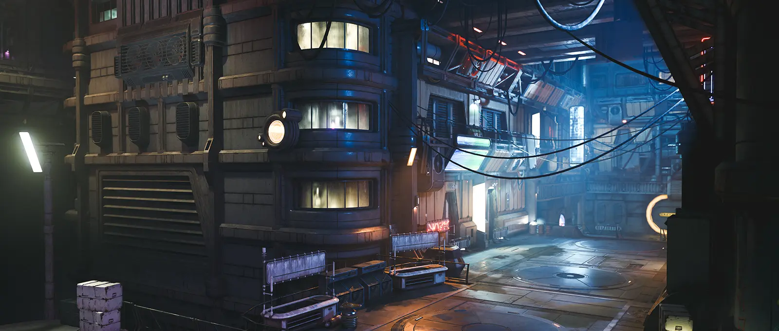
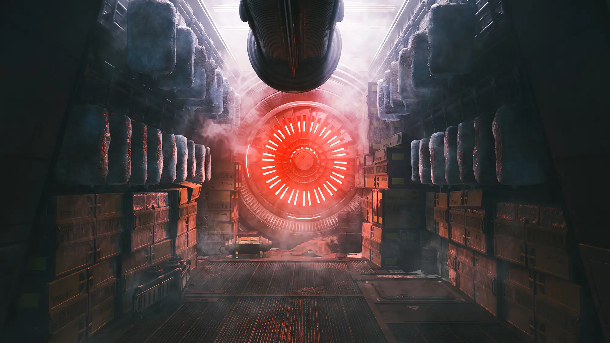
This is more of a personal story rooted in friendship and camaraderie rather than an opportunity to capture the grandeur of a mobilising Empire army or epic space battles, so expect to spend your time grounded in the collectively stunning series of terrestrial environments that Cal's journey will lead you through. Whether that is in the neon-lit underbelly of Coruscant or the large open spaces of Koboh and its shattered moon, there is much to explore, ancient archives and massive installations to discover, and interesting characters to meet.
- JEDI: SURVIVOR // LOCATIONS -
The NPC's offer lots of good opportunities, especially given that you can light them properly with the 3-point spots, and the same goes for Cal and BD-1 to be fair as both of them have upped their style game with a vast array of customisation options.
Cal's costumes can be mixed, matched, and coloured, as can BD-1's various component parts, while the lightsaber and blaster tweaks take things to another level. There are even some haircuts, both cool and dubious, to be found with the traders and, weirdly, in locked boxes around the galaxy – it's a game though, so why not?! Find a style that suits and pose for the camera, the caveat being that there are no poses.

- JEDI: SURVIVOR // COMBAT ACTION -
This photo mode is not just about static portraits though and, while they are certainly well suited to that, the tools are there to get some excellent action shots from the dynamic platforming and fast paced lightsaber battles, if you can get the timing that is.
The default route to the photo mode, via the options menu, can be a bit fiddly so it is worth trying the button remapping for instantaneous access, albeit at the expense of another function. Alternately, check out the Shortcut Controls found in the accessibility options where both photo mode and slow-motion buttons can be activated for a much-improved window of opportunity to capture the excellent animations.
Subscribe to the regular newsletter for all the latest features from TheFourthFocus.com
Verdict:
Star Wars Jedi: Survivor may be a textbook sequel, taking the strengths of its predecessor and building on them with greater scope and some new innovations that keep things fresh. It's a philosophy that is seen in everything from the level design and world activities to character customisation and combat, and thankfully in the photo mode too.
Minor quibbles aside, the outstanding camera freedom and excellent lighting options make it a pleasure to use, while some key innovation paves the way for future expectations. The fact that it's Star Wars barely even matters, this is a photo mode that all virtual photographers should experience.
Photo Mode Feature Set:
Access & Control
Photo Mode Access: Options menu (button remap available)
Camera Movement: Free camera with large bounding sphere Horizontal Pan: 360° Vertical Tilt: 180° Roll: ± 90°
Menu UI
Other Settings
Game Menu Settings


Kaiser OTC benefits provide members with discounts on over-the-counter medications, vitamins, and health essentials, promoting better health management and cost-effective wellness solutions.
Obituaries near me help you find recent death notices, providing information about funeral services, memorials, and tributes for loved ones in your area.
is traveluro legit? Many users have had mixed experiences with the platform, so it's important to read reviews and verify deals before booking.